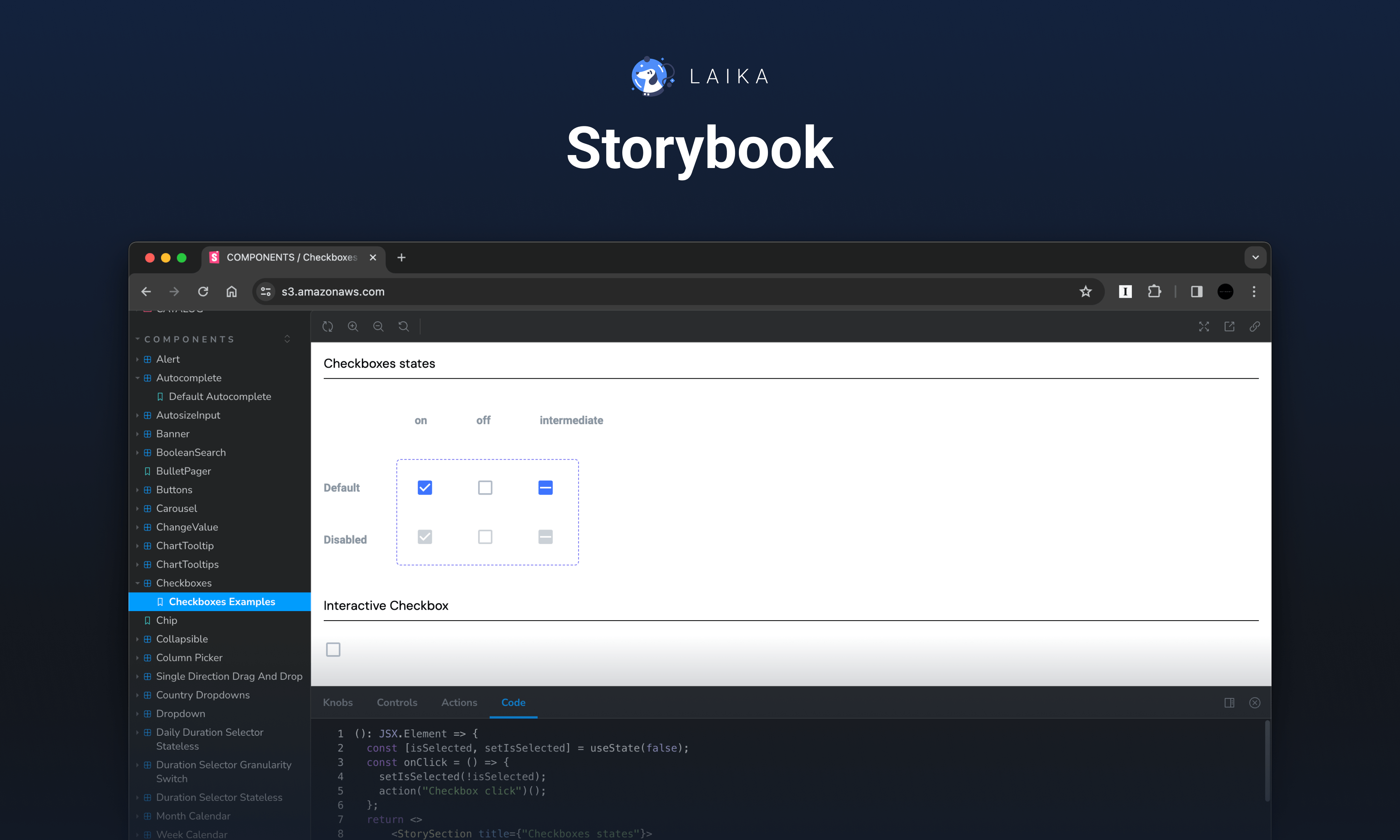
Laika Design System
SimilarWeb – Internship project
My role
Product Designer Intern – Conducting research, creating design assets, and collaborating with designers and developers to craft a design system.
Team
Gilad Israel – Supervisor
Eliya David – Intern
Timeline & Status
4 months, Internship project
Overview
SimilarWeb's design department decided to create a design system in Figma. This initiative aimed to organize and migrate all design assets from Sketch to Figma while reducing inconsistencies between these assets and the live product.
During my internship, I was part of a dedicated team tasked with building the Laika design system in collaboration with design, engineering, and leadership.
Highlights
Context
About SimilarWeb
SimilarWeb is a leading market intelligence platform that provides insights into website traffic, engagement, and marketing strategies across various industries. Renowned for its comprehensive data analytics solutions, SimilarWeb empowers businesses to make informed decisions and optimize their digital strategies.
The team

Me (Intern)
- Conducting research and defining design system specifications.
- Setting styles and creating components for the design system.
- Establishing the foundation for documenting the design system.
- Collaborating with another intern by providing guidance and then transferring all project work.

Gilad (Supervisor)
- Establishing tasks and deadlines.
- Guiding on complex design issues.
- Providing mentorship to team members and sharing insights.
- Conducting reviews of completed tasks and providing feedback for improvement.

Eliya (Intern)
- Collaborating with team members to engage in discussions and define design decisions.
- Contributing to design components creation.
- Documenting the design system.
- Assisting in finalizing the project for a seamless handover to development.
Team's initial tasks
1. Transfer the existing UI Kit from Sketch to Figma.
2. When transferring, eliminate inconsistencies between the product and the existing UI Kit.
Discovery
To gain a deeper understanding of the tasks assigned to us, we initiated a discovery phase.
Researching the existing design system
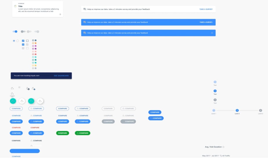
Our exploration started with an in-depth examination of the existing design system in Sketch. Though initially grounded in Atomic design principles, it ended up being a collection of cluttered files. It was obvious that the existing design system had several important problems:
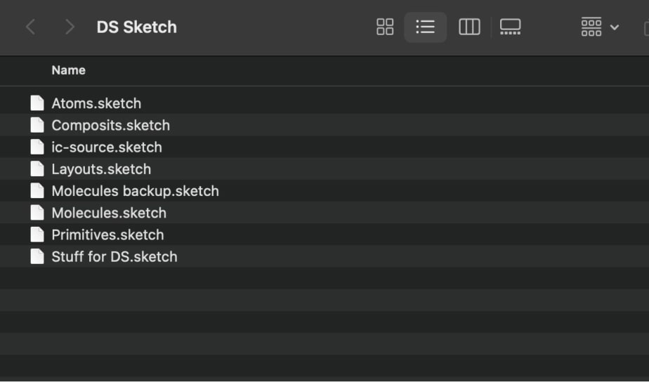
The file structure is complex and incomprehensible, presenting a challenge for new designers to navigate.
Different elements are located on one page, which makes it difficult to find specific components.
Some items have no description or very short description, making the use case difficult to understand.
Handwritten comments were the only indicators for distinguishing between old and new versions of elements, which led to confusion.
Interviews with designers
In a sense, SimilarWeb designers are primary users of the design system, because they are using it in their day-to-day work to create new features. That's why it was important for us to talk to designers from different departments to provide a deeper understanding of the current design system.
Based on the responses, an insight map was created using sticky notes.
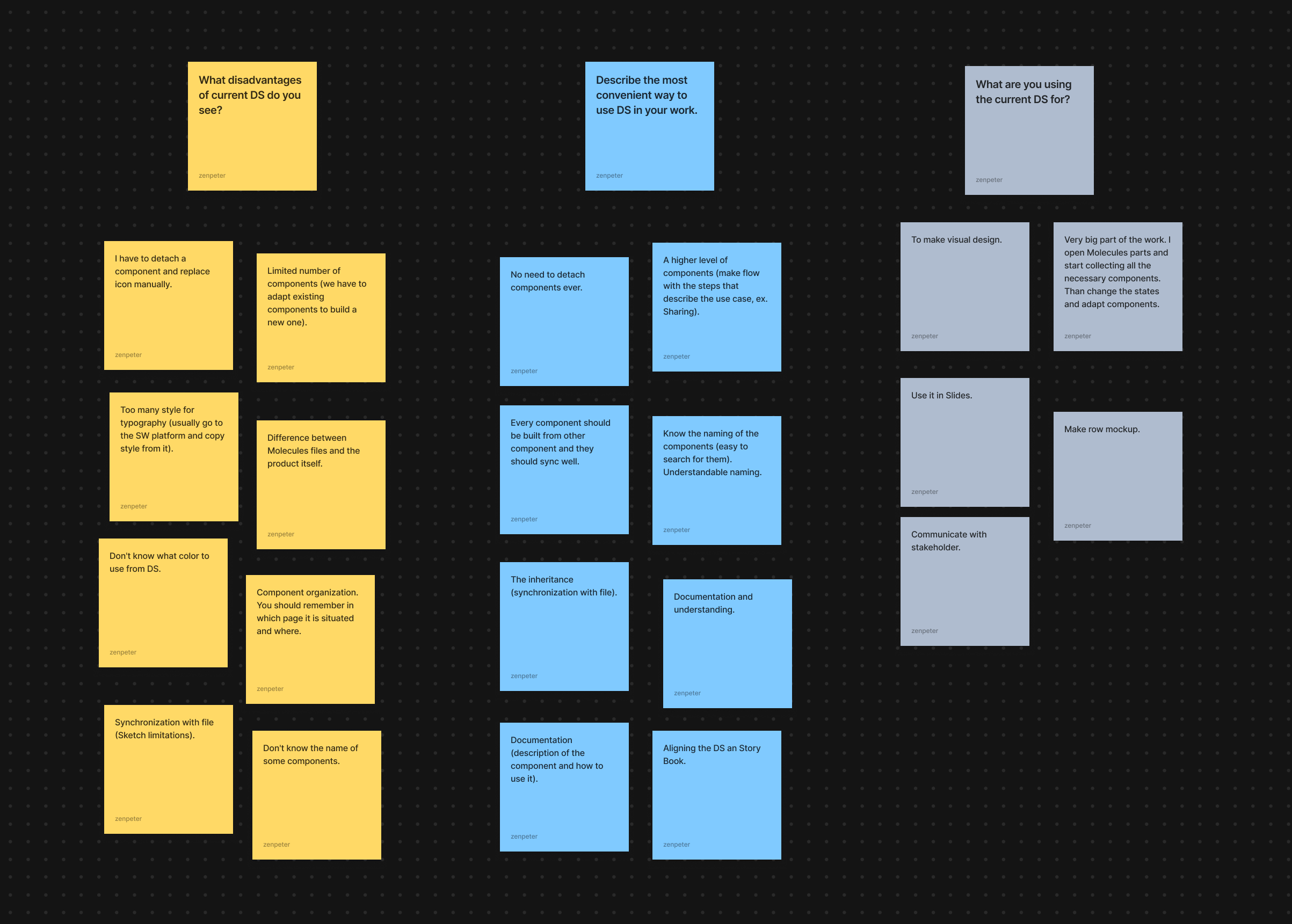
This map helped identify recurring themes and ideas:
Usage examples
The importance of including usage examples for complex components in the new design system.
Structural clarity
The need for a structured system that facilitates easy component discovery and access to relevant information.
Component variability
Ensuring that component variations cover all potential use cases to eliminate the need for detaching components for manual customization.
Consistent naming
Establishing a logical and consistent naming system across all design assets.
Analyzing existing design systems in the market
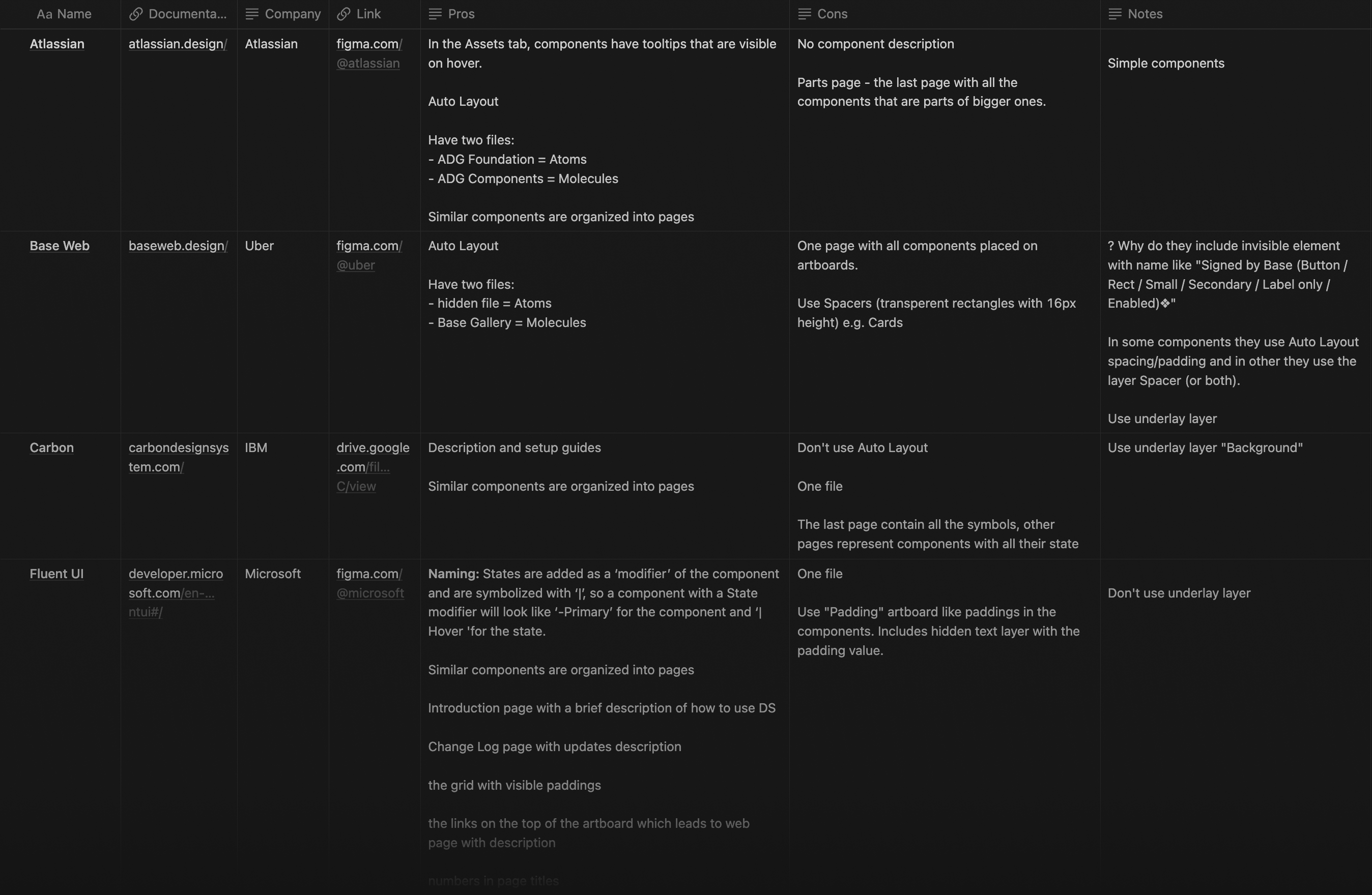
The final leg of our research involved analyzing existing design systems in the market. This enabled us to gather ideas and glean best practices, which we documented in a knowledge base. This repository would serve as a valuable reference point throughout the project, guiding our decision-making and implementation processes.
Definition
Goal
Based on the information collected during the discovery phase, the goal of the project was determined.
Create a Figma-based design system, resolving inconsistencies between previous design assets and the product. The new design system must be complete, easy to use and well documented.
Constrains
We have also established several key criteria that will guide us through the project and aid in evaluating whether we meet all requirements upon completion.
Responsive layout
Given that SimilarWeb is a web-based product, the design system should adhere to responsive design principles to accommodate various screen sizes.
Utilization of Figma features
Components must be crafted using Figma's advanced features such as Variables and Auto Layout.
Structural clarity
The design system's structure should facilitate easy navigation, ensuring that designers can quickly locate necessary elements.
Consistent naming
Employing a uniform naming convention for components will enhance communication within the team and streamline the development process.
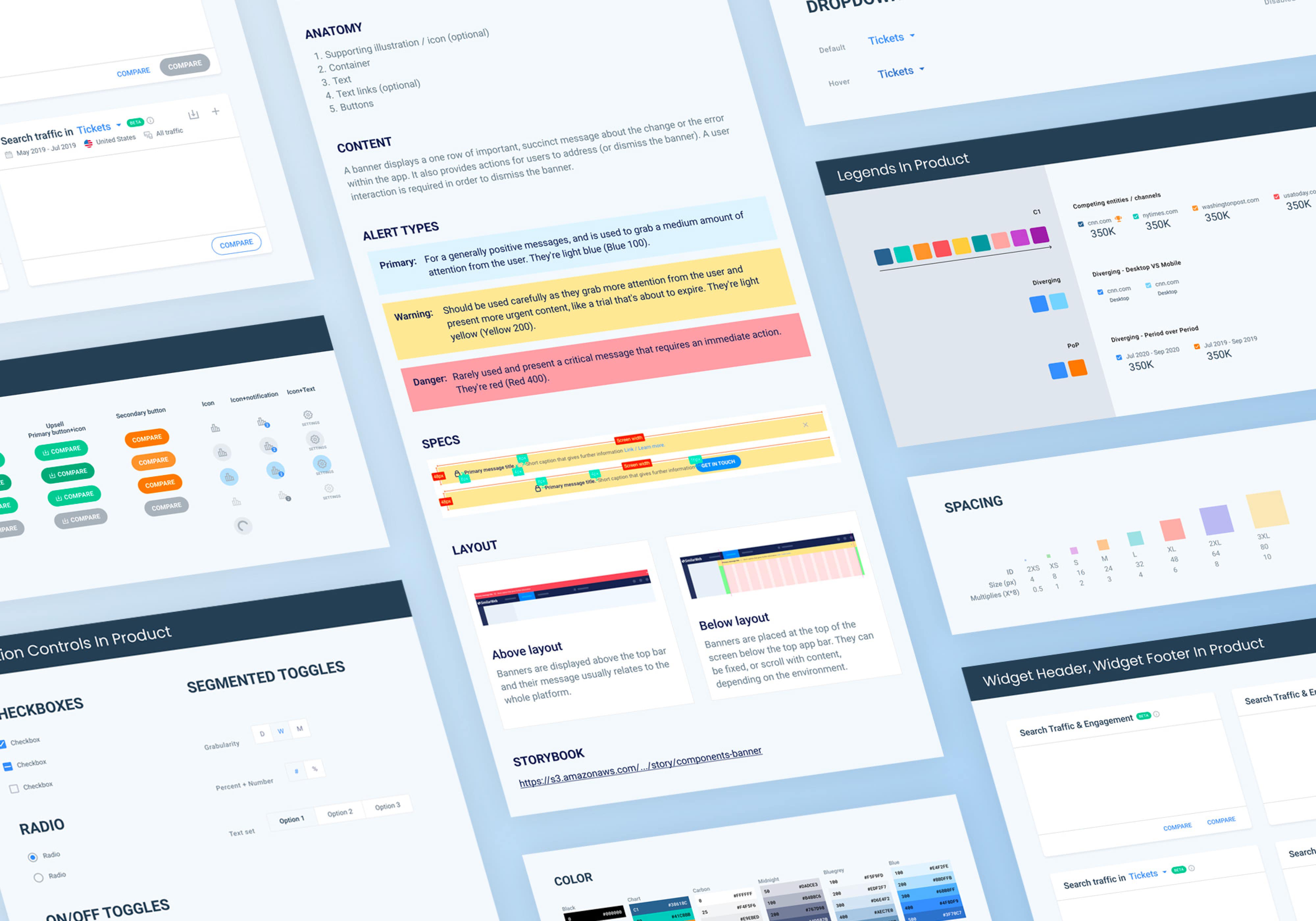
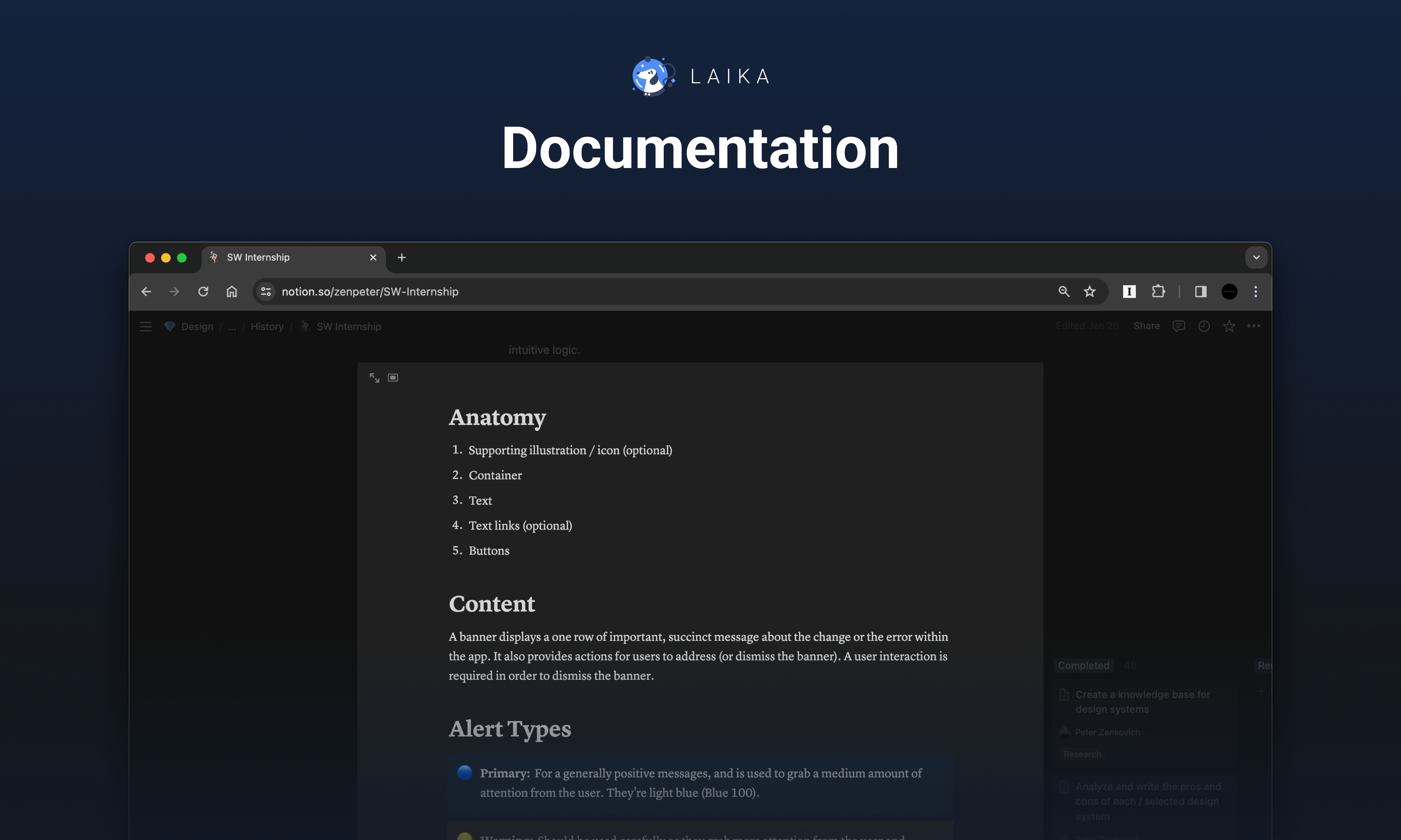
Comprehensive documentation
Guidelines for complex components should cover usage scenarios, live examples, states, variations, and other details to aid designers in effectively utilizing them.
Ongoing collaboration
Regular communication with representatives from the design department and developers will ensure that the design system meets designers' needs and can be seamlessly implemented in code.
Structure of the project
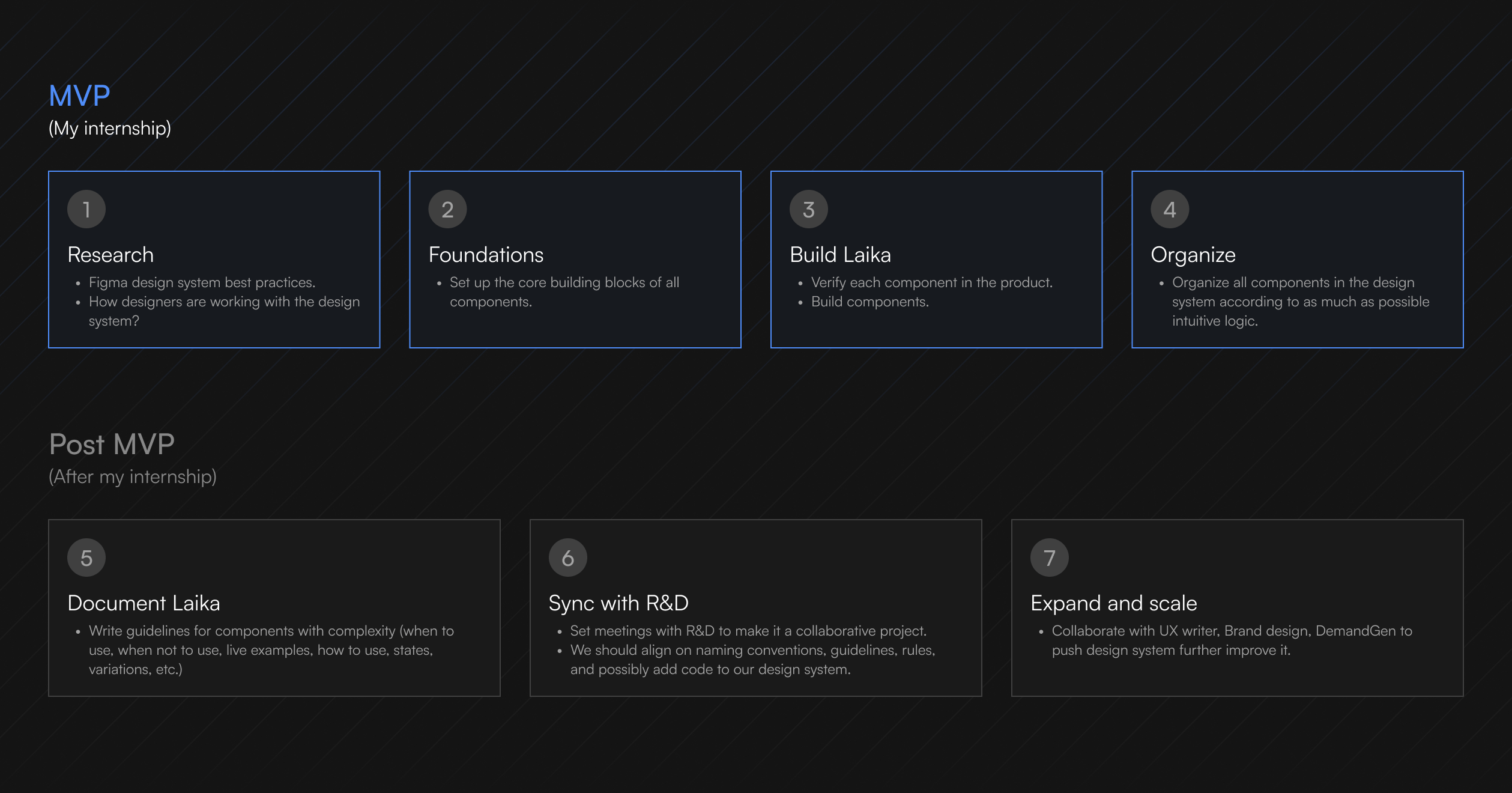
The supervisor provided us with a project structure, divided into two stages: MVP and Post-MVP.
Due to time limitations during this internship, I could only contribute to the MVP phase before transferring all project work to another intern.
Design
Process
Once the project goal was formulated and the project structure was determined, we began the development phase. The workflow during the development phase was based on five steps.

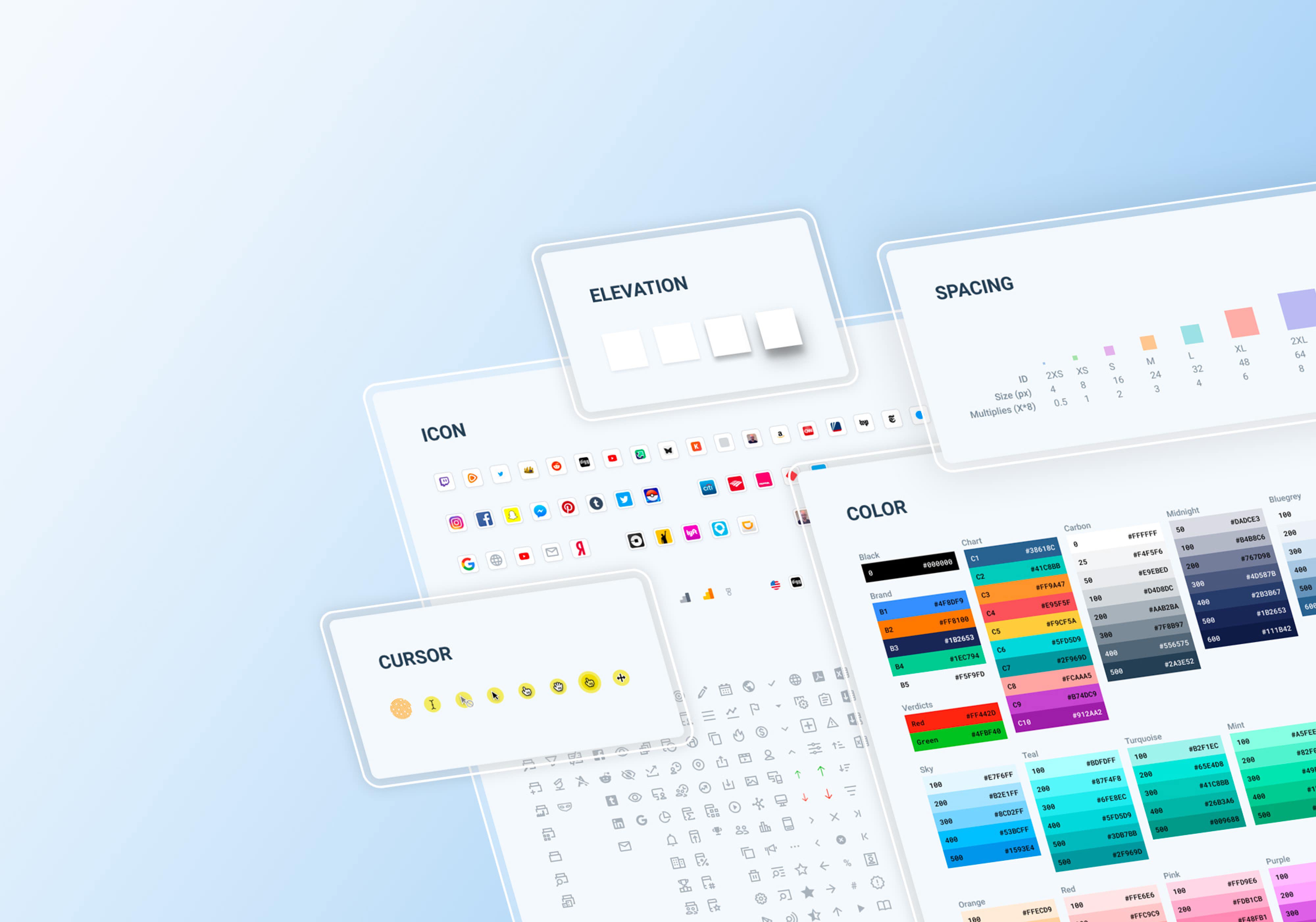
Challenge 1. Structure
As we gained insight into the importance of structural clarity for designers' ease of navigation and quick access to necessary elements, we established key principles based on knowledge gathered from other design systems:
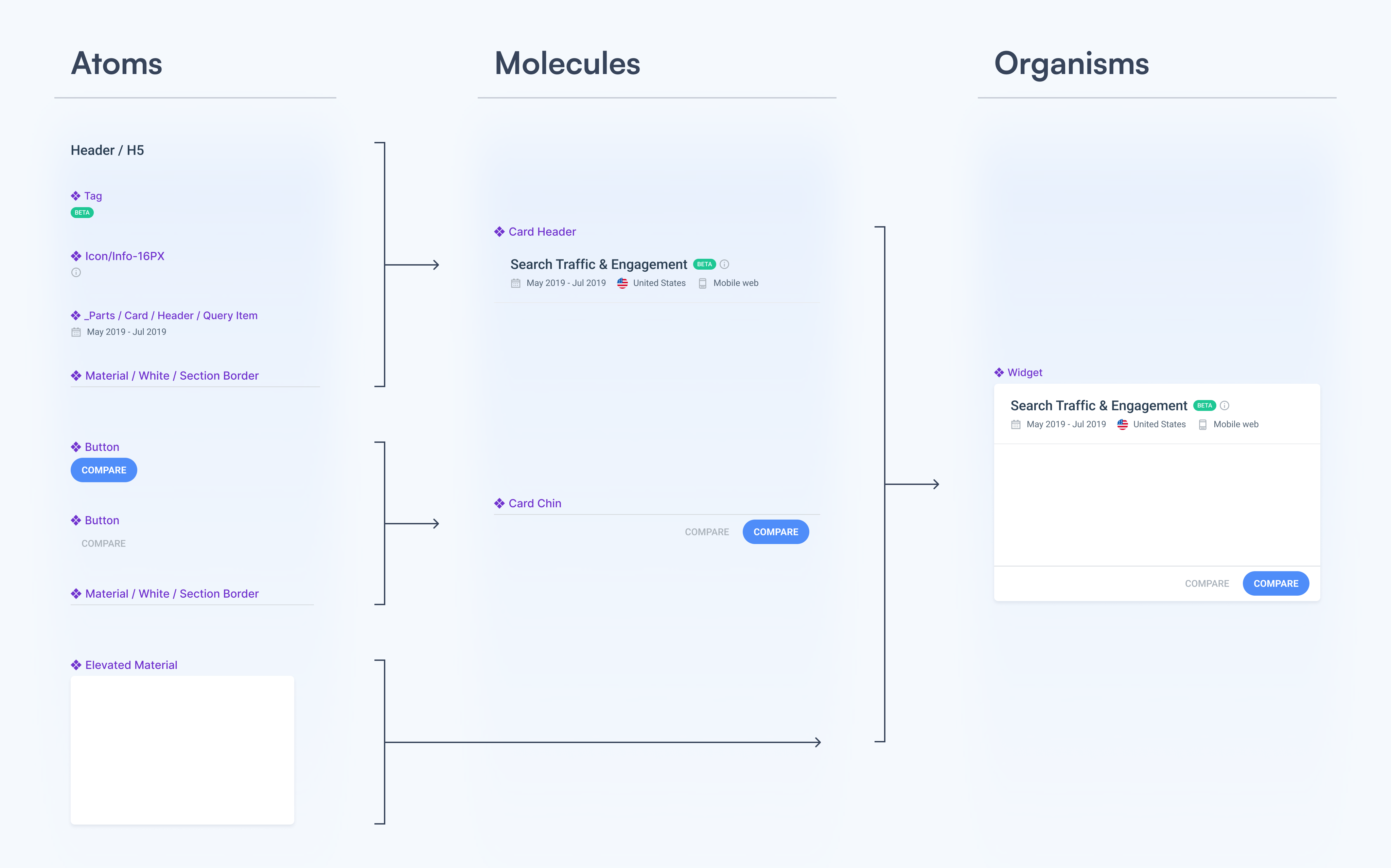
Embracing Atomic Design
The design system follows Atomic Design principles, organizing elements into a hierarchy. Starting with "atoms" like buttons and text fields, these elements combine to form "molecules" (e.g., dropdown menus), which in turn create "organisms" (e.g., forms). These "organisms" are then used to build templates and pages.
Organizing system pages
Following the Atomic design approach, we opted to divide our system into multiple pages, including:
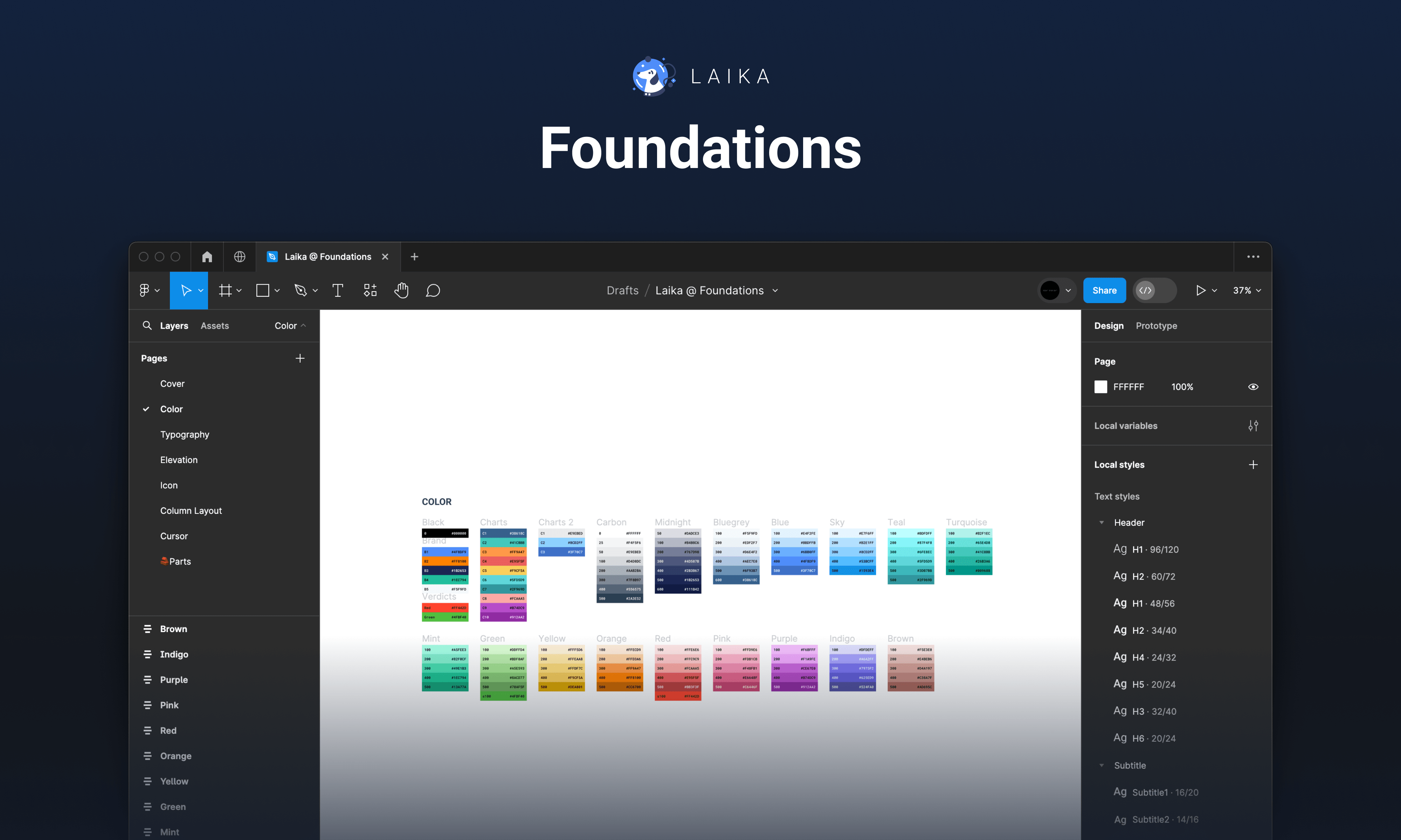
- Foundations: encompassing colors, text styles, grids, icons, etc.
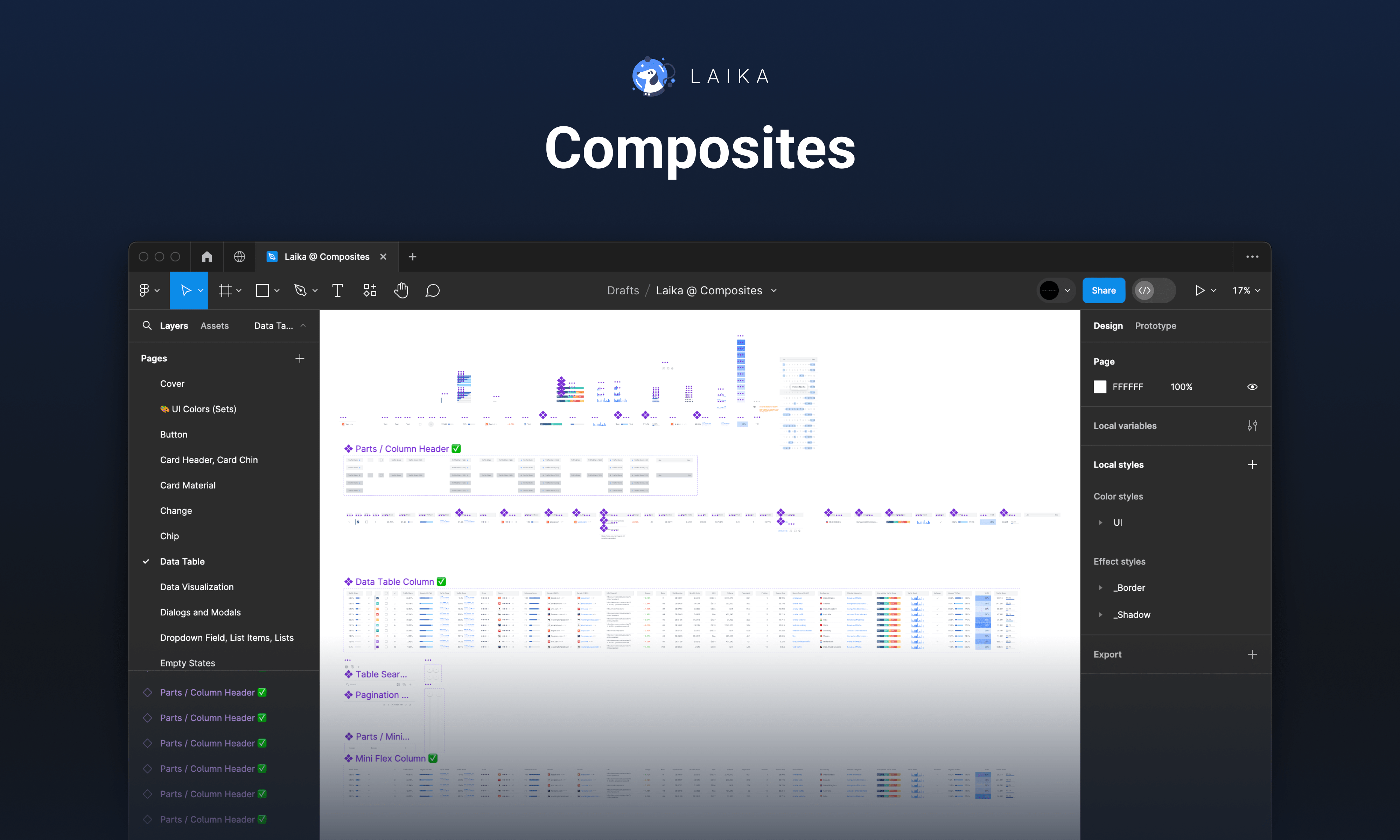
- Composites: housing individual components and their constituent parts.
- Sticker Sheet: containing all components and templates with descriptions.
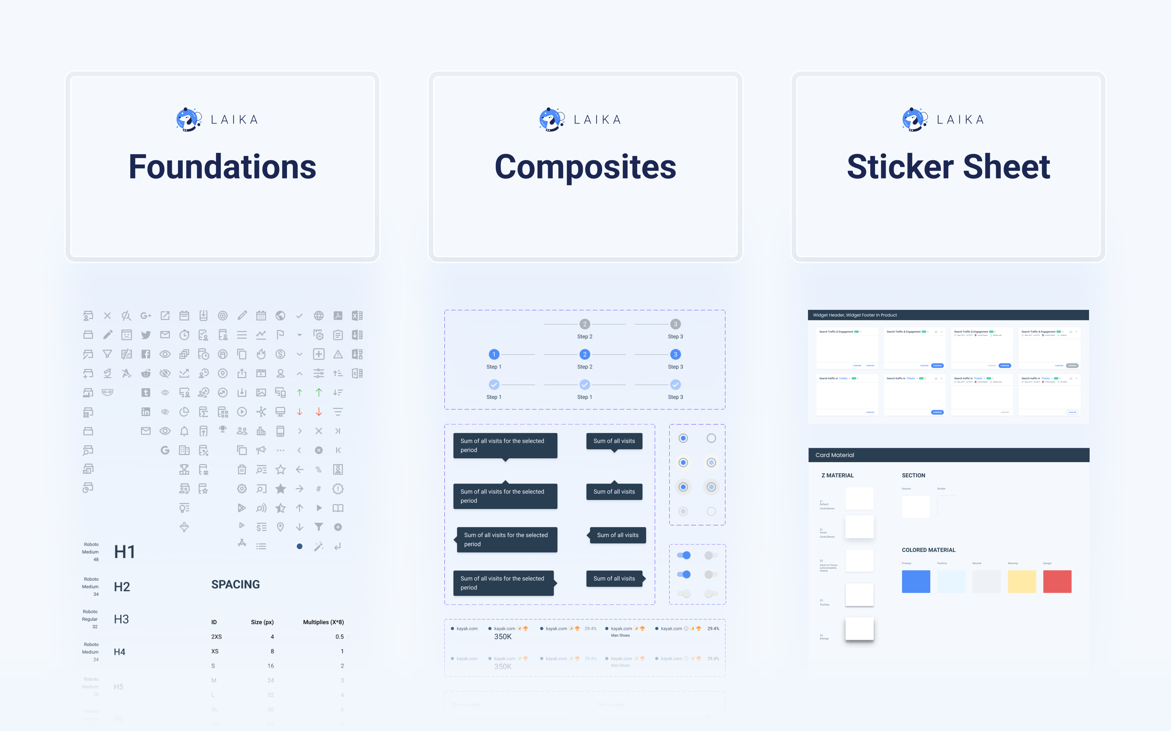
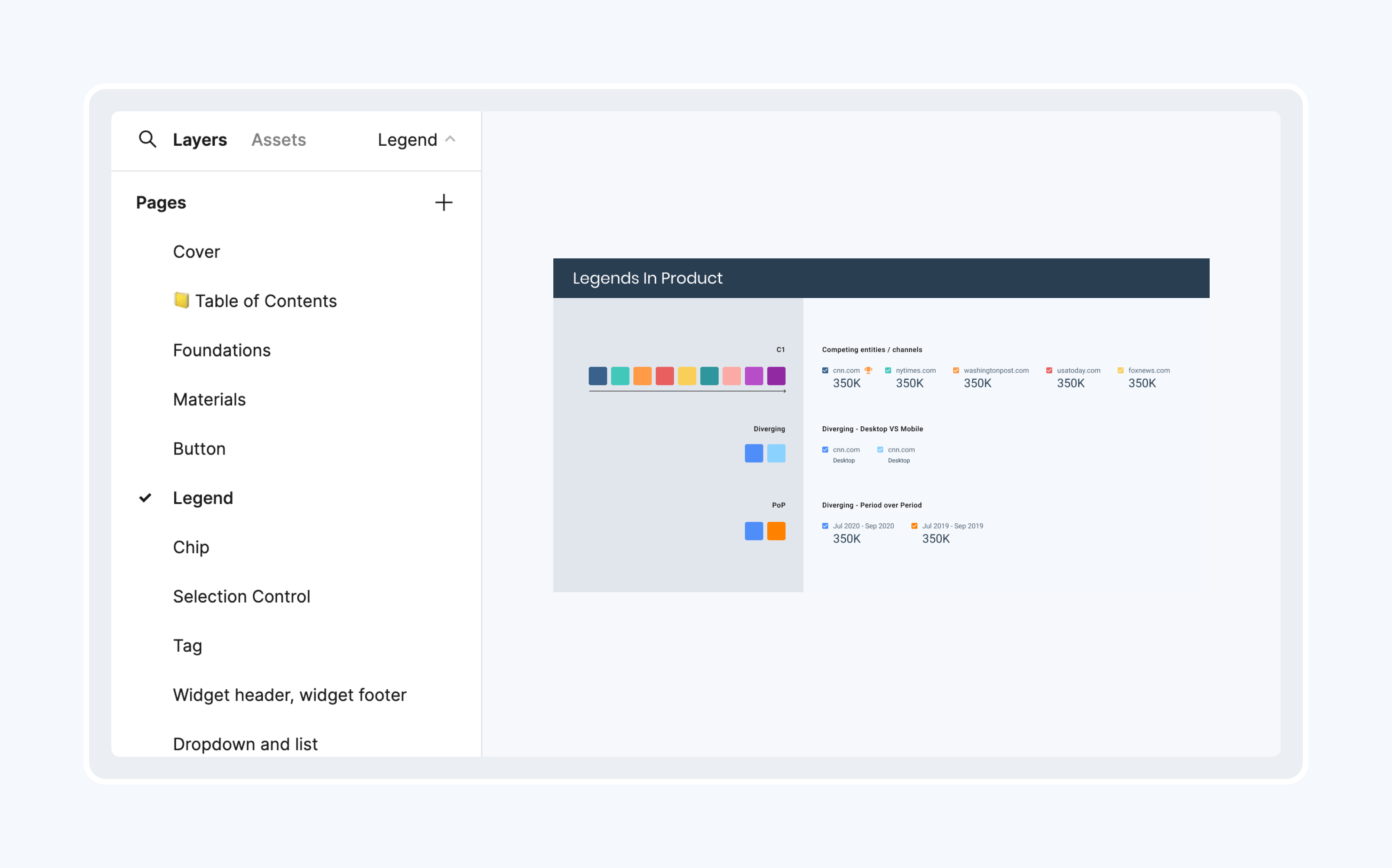
Grouping components
Each page within the Composites or Sticker Sheet files is dedicated to specific groups of components, ensuring semantic organization and ease of navigation.
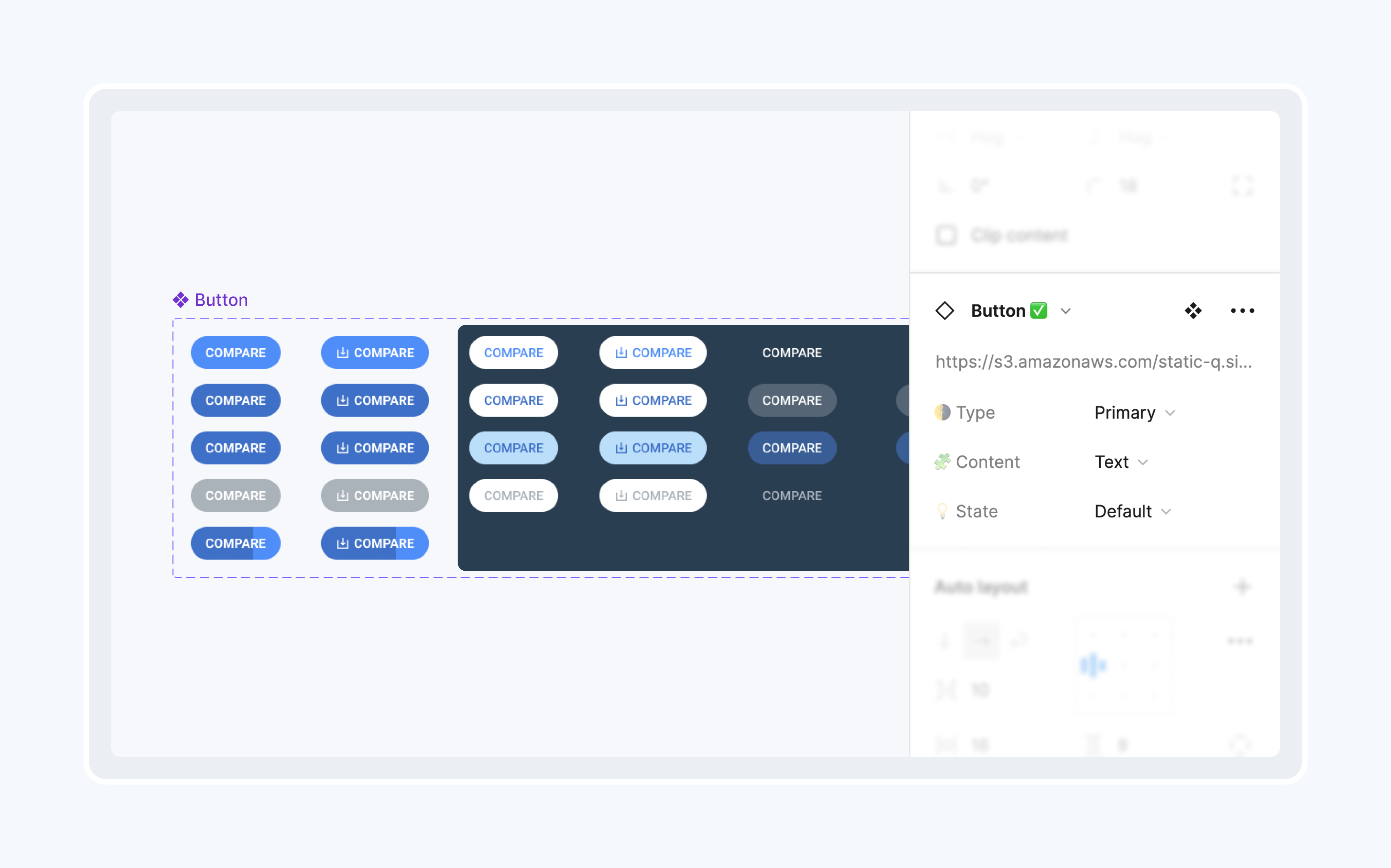
Utilizing variables
Leveraging the latest Figma update introducing Variants, we utilize Variants to create user-friendly components, allowing for easy state customization through Figma's right panel.
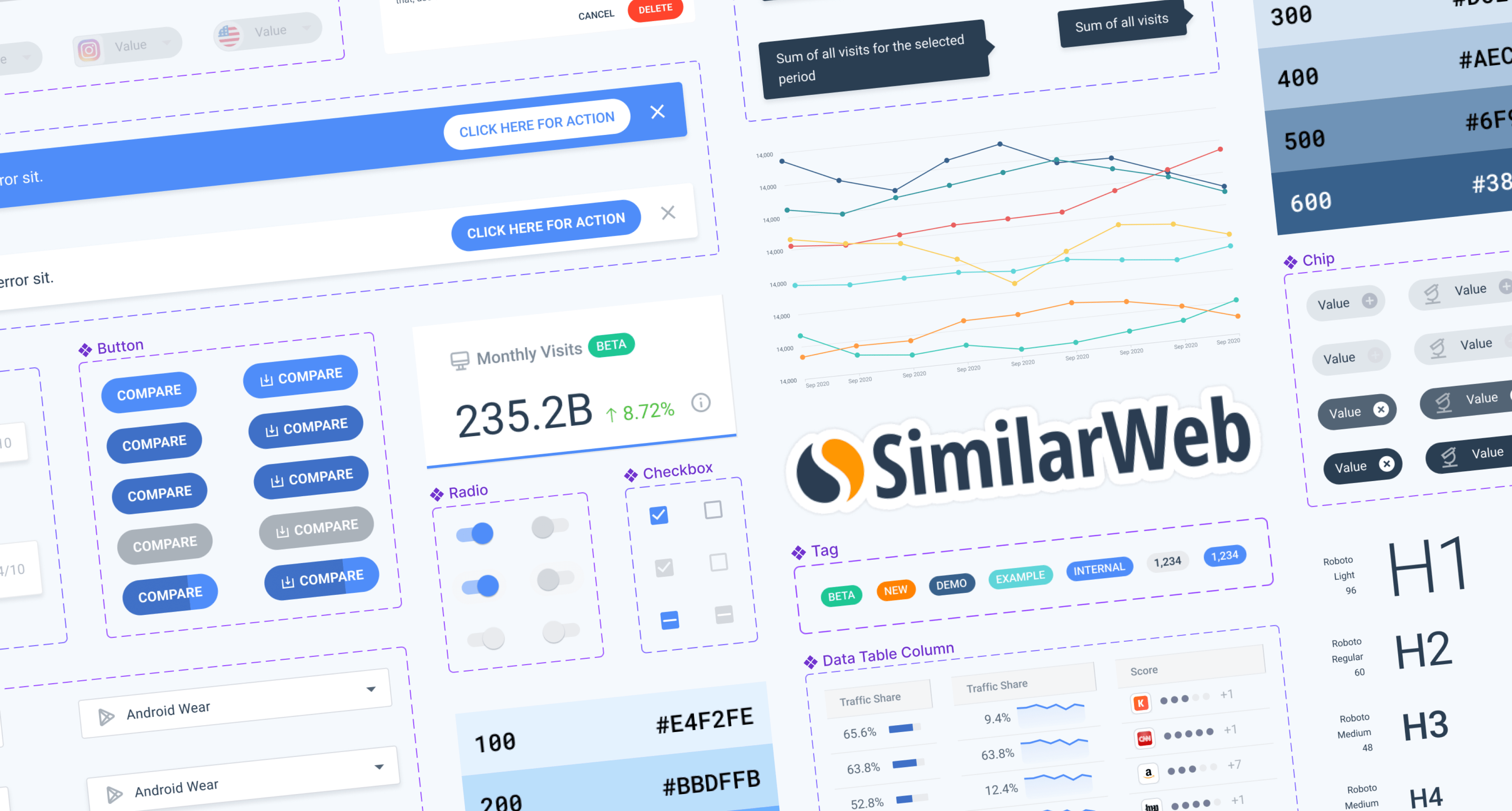
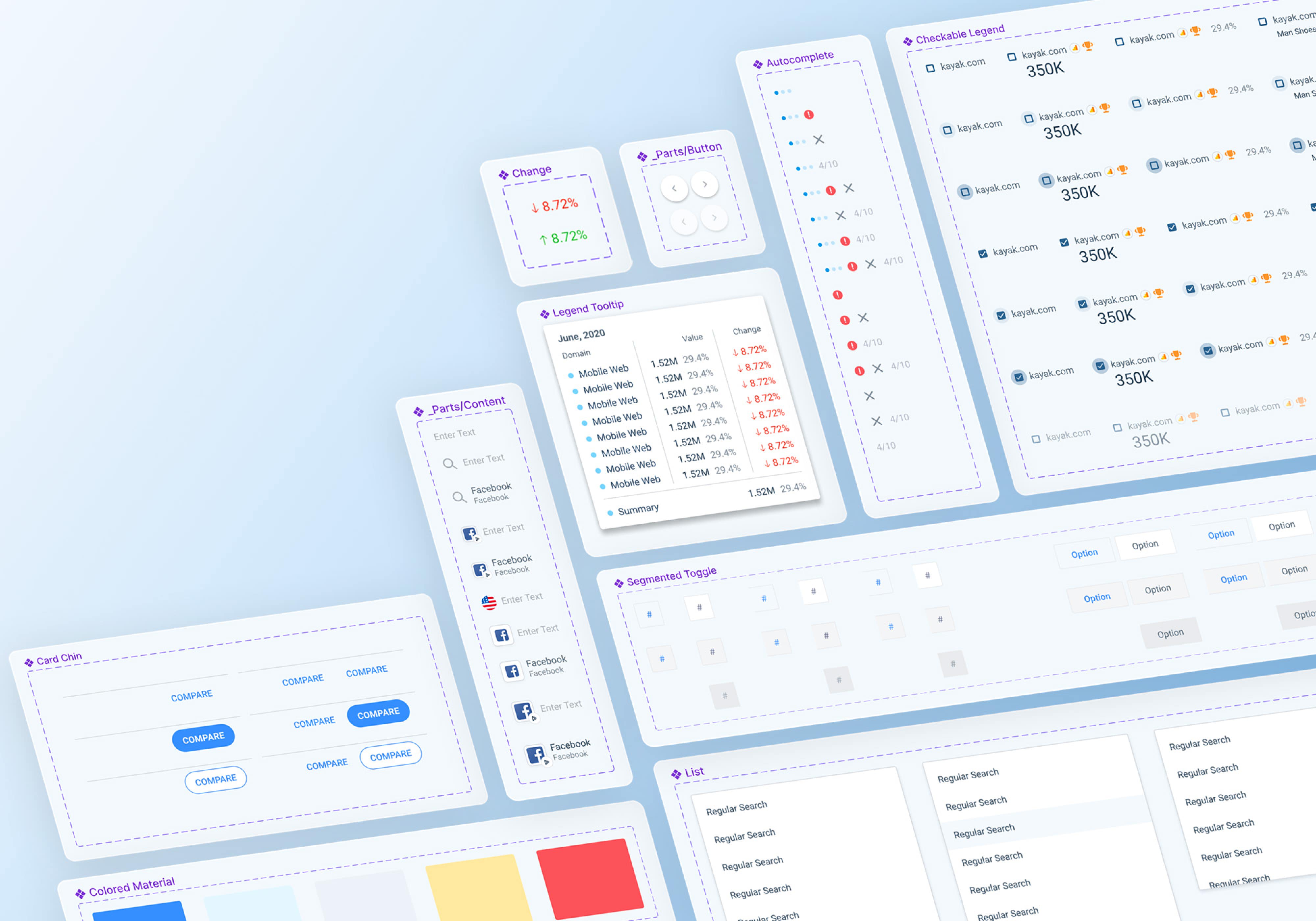
Challenge 2. Component selection and construction
Listing all the necessary components
The entire Laika team convened to compile a comprehensive list of components. This list was derived from components utilized in previous projects or from the old design system in Sketch, as well as any new components required for future use.
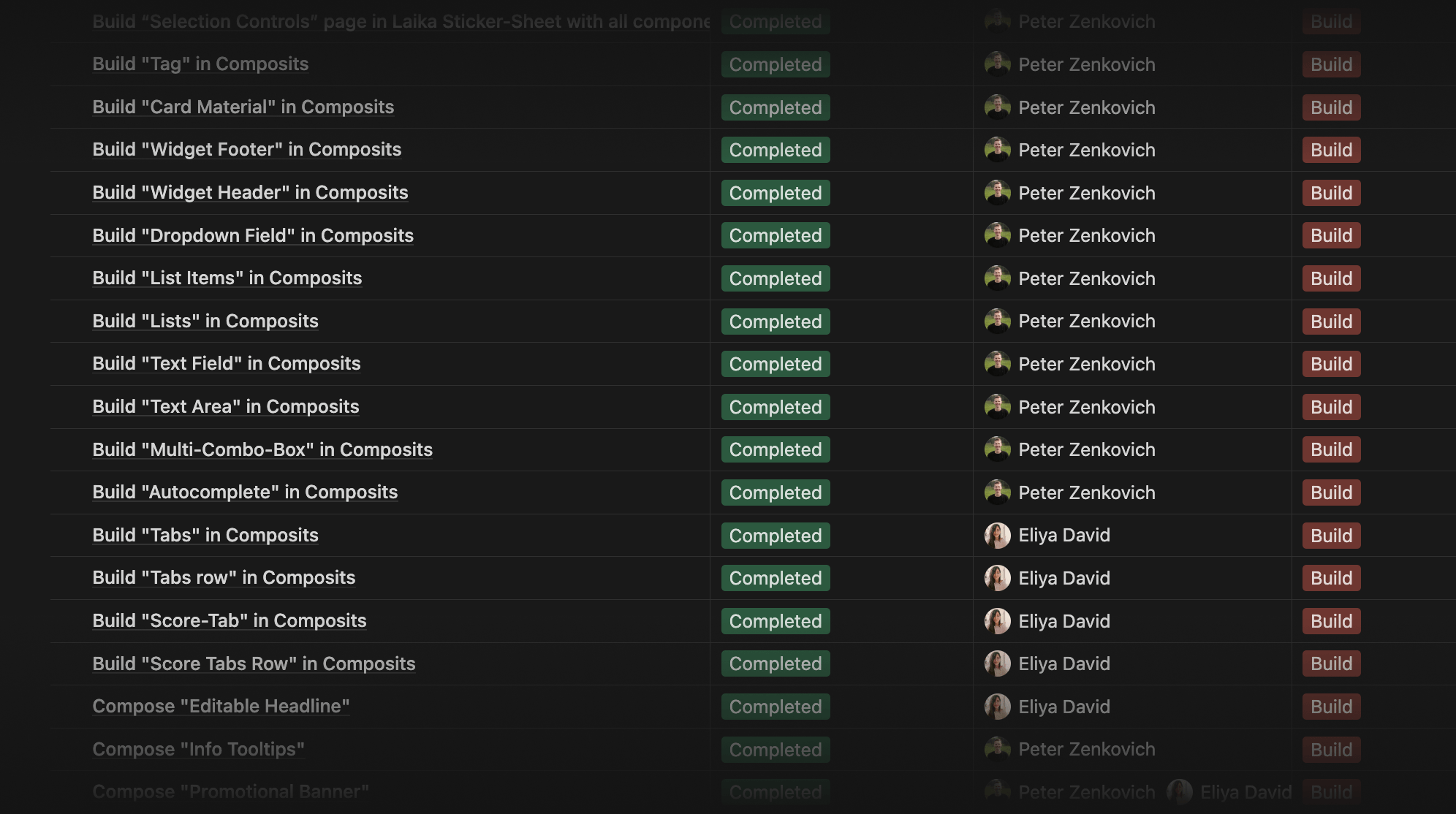
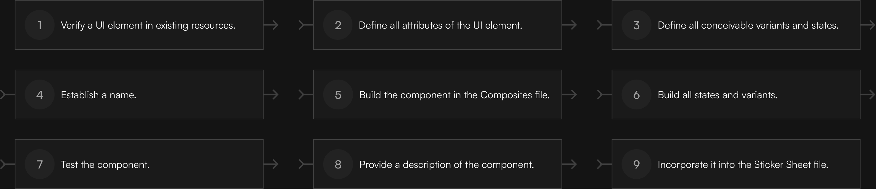
Sequence of the component creation process
Also, we defined the steps for the component-building process.
Dealing with inconsistencies
During the phase of defining attributes and variants of a UI element, we resolved inconsistencies between current design assets and the product. Due to the considerable number of inconsistencies in UI elements, we established a rule that helped us to be efficient:
Minor inconsistencies were addressed by aligning the component with what is already in production, while major differences were escalated for discussion and resolution.
Delivery
Internship outcomes
During my internship at SimilarWeb, working in the Laika team, I completed the MVP stage of the design system, establishing a strong foundation by crafting components and resolving inconsistencies between previous design assets and the product.
3
Figma files
~200
Text & color styles
55
Components
~800
Variants
The MVP of the Laika design system consists of three Figma files:

Post-internship Laika project
Project handover
After my internship, I conducted several sessions with Eliya, guiding her and transferring all necessary resources to continue working on the post-MVP stage.
The Laika team continued its efforts and ultimately completed the Laika design system, delivering several benefits to the company:
Efficient mockup creation
A significant reduction in mockup creation time through a component-based approach.
Automated component customization
Elimination of manual customization of components by accounting for all possible element states during creation.
Consistent product development
Greater consistency in product development by synchronizing designers' and developers' resources.
Enhanced communication
Improved communication through standardized component names and states
Smooth design updates
Easier implementation of design changes during visual style updates, facilitating a smoother redesign in 2021.
Post-MVP stage results
Project takeaways
Mastering UI elements
By analyzing and crafting components, I learned a lot about individual UI elements, enhancing my skills as a Product Designer.
System maintenance importance
A design system is a living entity that requires a dedicated team actively involved in its growth and maintenance.
Cooperation for mutual benefit
A well-rounded design system that caters to the needs of designers from various departments and developers requires representation and input from each side during its creation.